This blog is meant to be about things I’ve learned, whether through courses/training/talks or through my own mistakes.

I realised that I haven’t really spoken about my recent journey from story points/velocity to the liberating world of throughput, Monte Carlo, and data-based probability forecasting. Liberating because instead of endless time spent “sizing” and arguing about what to size or how to size it, now all I need to help my team get feedback (and help my Product Owner give forecasts) is to pull data about what has actually happened. Most of the time, the team doesn’t even need to be involved: they can merrily continue doing value-add activities.

The one downside is, people don’t always like the answers the numbers give them.

Before I continue, I’d like to add a disclaimer. Statistics hurt my brain. I rely heavily on tools and techniques advocated by people a lot smarter than me. If you’re in any way interested in learning more about the topics I’m about to mention, please look up people like Dan Vacanti, Prateek Singh and Troy Magennis. I’ll add some links at the end of this to sites and blogs that have helped my teams and me get to grips with the basics, but I am not qualified to explain how this works. I understand why it works, I just can’t explain/teach it.

First, some background. I have always found story points and velocity extremely painful to work with when it comes to forecasting. Planning Poker can be a good tool to help a team have a conversation and check in that people are on the same page regarding how big something is, but once we know no one is sitting on a piece of hidden information or an assumption that no one else in the room is aware of, to use them for anything more becomes super complicated and “fragile”. And I’m not even talking from a statistical perspective (ref. Flaw of Averages.). If you’re using velocity for forecasting, there are plenty of sizing antipatterns out there, WHICH MOST PEOPLE DO ALL THE TIME, that break it. I’m not going to go into these now. I’ve spent years trying to explain/teach about sizing antipatterns. One of the greatest reliefs about abandoning velocity as a planning tool is that I no longer have to worry about it! If teams find sizes helpful (especially when transitioning), then they can do it when and how they want to, but I no longer use velocity for forecasting so it truly doesn’t matter what their number is at the end of the day – or even if they capture it anywhere.

So what is this magic and how does it work?

The first bit of magic is throughput. How many items your team completes in a period. (If you’re doing Scrum, your period is likely to be a sprint, but the period can be however long or short you want or need it to be, as long as you always use the same period across your calculations i.e. don’t use throughput based on sprints (weeks) to try to forecast based on days.) Now, you do need to agree and understand what done means. For some of my teams, done is ready for Production but not yet deployed. For others, it might be deployed to Production. It will depend on how your teams work and what is in their control. Again, what done is for you doesn’t really matter in this context, as long as it’s always clear what done means in your world. So the first piece of data you need, is 3-10 datasets, over a period similar to the one you want to forecast, which gives you how many things the team finished in each period. If you’re using a tracking tool, this shouldn’t be hard to get.

The second bit of magic is Monte Carlo. I am not qualified to explain Monte Carlo or how it works. Luckily someone else has done a really good job of doing it for me in this Step-by-step Guide to Monte Carlo Simulations. Monte Carlo answers two very common questions:

  • How many things are you likely to complete in this amount of time? And,
  • How long are you likely to take to complete this many things?

And the best thing? Probability is built in! So you can say we have a 50/50 chance of completing this in 3 months or less but an 85% chance of completing this in 7 months or less. And what inputs does this wonderful magic need? Just your throughout. That is all. No estimating or sizing. No sitting in rooms trying to break things down. No arguing over capacity and approaches and such like. Just counts of things completed in periods.

So I can hear some people already have questions like “But things don’t take the same amount of time” and “What if it’s a really big thing – surely you need to know how many smaller things there are?”. The first concept that makes this easier is “right-sizing”. It’s always a good thing to break things down as small as possible (without losing value). So teams should still do this. And for your team, especially if you’re doing Scrum, you probably already have a “right size” in mind. Perhaps things shouldn’t take longer than two weeks to be done? Or perhaps a week? Whatever it is, agree what a “right size” is in your space to get something to your definition of done, and as long as most of the time things are about that size (or smaller) the outliers will work themselves out in the wash (you’ll have to either trust me on this or go learn more about “The Law of Large Numbers”). Related to right-sizing, there is also a very powerful feedback tool called “Aging”, but that will need to be a topic for another blog post.

The second question could be more complicated. If you have something really big you probably would break it down to do the work. The simplest way would probably be to go and look at work that you think was a similar size and count how many pieces that was in the end. Or if you want to use Monte Carlo to help you, here is an idea for how one could do it (although now it starts to feel like you’re in the “Inception” movie).

At the end of the day, you don’t have to trust me at all. If you’re curious, then I’d encourage you to run an experiment and use Monte Carlo forecasting in parallel with whatever technique you’re currently applying and compare the results. I’d be interested to hear what you uncover!

LINKS

One of the workshops I attended at Agile2022 last year was called “Three Components for Kick-A$$ Collaboration” facilitated by Diane Zajac. It was a very practical workshop and I came away with a load of great ideas and tools. There is one, in particular, I have found particularly insightful whenever I have used it – both in terms of reducing decision-making time plus in terms of seeing who really cares about an outcome (hint: it ISN’T always the people doing the most talking!).

I wasn’t able to find a write-up anywhere although I did find this video of a similar talk she co-facilitated, so I thought I’d describe the tool and how to use it based on what I learned in the workshop.

The tool is called a Collaboration Contract and the first thing to understand is that, in this tool, someone might play six possible roles in making a decision. The three roles on the left are decision-making roles; the three roles on the right are non-decision-making roles. Specifically:

  • EXPLAIN role (there is only one decision maker): I will make the decision and explain my reasoning to everyone else
  • CONSULT role (there is only one decision maker): I will consult/ask for input before making the decision, but I will be the decision maker.
  • AGREE role (there are many decision-makers): I will agree with other decision makers on the decision
  • ADVISE role (non-decision-maker): I want to give input/advise the decision maker, but I won’t make the decision
  • ACCEPT role (non-decision-maker): I will accept the decision regardless of what it is
  • ABSTAIN role (non-decision-maker): This decision doesn’t impact me so I have no interest in what it is
Decision-Making Roles

The idea behind the tool is that everyone in the discussion puts themselves into one of the roles for a specific decision. The easiest way to do this is to list the roles in columns and then have each row be a decision that the group needs to make. People should then add their names to one of the columns for each decision listed. You could find that depending on the decision under discussion, people will want to take different roles in the decision-making process. Below is an example of a completed Collaboration Contract:

Depending on where people place themselves, you may notice some interesting things or conflicts that could need discussion, e.g.

  • If one or more people have picked a sole decision maker (EXPLAIN/CONSULT) role: there needs to be a discussion about whether this IS a sole person’s decision and, if so, which of those people it is. The idea is that people will then shift themselves on the contract based on the outcome of that discussion.
  • If some people are in the joint decision (AGREE) column and some people are in the sole decision maker (EXPLAIN/CONSULT) column, then there needs to be a discussion about who should actually be making the decision.
  • If there is only one person in the joint decision maker (AGREE) column, then the group needs to understand why that person is expecting a group decision whereas the rest of the team believes it’s not their decision to make. Who then should be making the decision?
  • If you have someone in the CONSULT column and no one in the ADVISE column, then who is the decision maker expecting to consult with? And why does that person not see themselves in the adviser role?
  • If everyone is in the non-decision maker (Advise, Accept, Abstain) roles, then who is making the decision? Similarly, if a key person (e.g. the Finance Manager for a decision related to budgets) places themselves in an Accept or Abstain role, that’s worth unpacking.
Column Rules/Constraints

Ways this tool has helped me with team decisions when I’ve used it:

  1. When people placed themselves, it was easy to see who wanted to have input or make a decision and who did not – which meant a smaller group for reaching a consensus when it was a group decision.
  2. We’ve highlighted decisions (before the conversation) where some people thought there was a sole decision maker whereas others saw it as a group decision. This helped us have the right conversations about roles and responsibilities BEFORE we tried making the decision.
  3. We’ve also highlighted decisions where everyone agreed there was a sole decision maker, making the whole decision-making process much easier and quicker!

One last snippet of wisdom on this topic from the workshop: “With decisions comes greater responsibility”.

Here’s another useful link about the tool by Diane: https://onbelay.co/articles/2019/1/19/collaboration-contracts

Hopefully, you will try this tool and get some value out of it. Let me know how it goes.

I watched a recording of a webinar from the NeuroLeadership Institute recently, and it struck me how it supported the approach I’ve been advocating for preparing work (see Change managing our backlog refinement).

Here is my key take-out from the webinar which I believe supports an iterative, repetitive approach to creating understanding.

How do we mitigate this? By creating connections and giving people time to pause and digest.

What does this insight change for you?

Is that even the right question?

Sprint Reviews: my experience is that they can swing from compulsory to optional and very often fall short of their true potential. Some teams see them as “demos” – a place to “show off” and prove that we did some work. Others see them as a place to give Stakeholders the reassurance that we are delivering against our plan and are on track. Sometimes, they can be a place for feedback: usually when our customer is external and it’s the only chance we get to show them something while it’s still in progress. I’ve seen organisations make them compulsory – but then only invite the team, and I’ve seen other organisations choose to do them quarterly, usually after a major feature has gone live, and then the team spends hours preparing for them. Usually, it’s a presentation. Rarely is it interactive or collaborative.

I was working on a team that frequently cancelled their sprint review. Arguments ranged from:

  • We’ve already shown the stories to the key subject matter experts (SMEs): they have given their feedback
  • It takes too long to prepare for it: we’ll show everything once we have the end-to-end journey completed (and often, released)
  • There was an Exco meeting already this sprint: we covered everything then. No need to repeat. Let’s just have a team review. (Side comment – if your Scrum team needs a meeting every sprint to show each other what happened in the sprint, then that’s a signal there are other problems to solve.)

Cancelling a sprint review made my Scrum Master heart very heavy. The Scrum Guide describes the Sprint Review as follows:

The purpose of the Sprint Review is to inspect the outcome of the Sprint and determine future adaptations. The Scrum Team presents the results of their work to key stakeholders and progress toward the Product Goal is discussed.

During the event, the Scrum Team and stakeholders review what was accomplished in the Sprint and what has changed in their environment. Based on this information, attendees collaborate on what to do next. The Product Backlog may also be adjusted to meet new opportunities. The Sprint Review is a working session and the Scrum Team should avoid limiting it to a presentation.

Some of these conversations WERE happening. But they weren’t happening in our Sprint Reviews nor were they happening with the whole team. These conversations also often focused on the roadmap from a feature-list perspective rather than how our product was evolving. Our sprint review had turned into a presentation – and one that required a lot of preparation – so it was no surprise that the team wasn’t seeing the value. We tried some experiments to get more interaction out of our attendees (often about 50 when everything shifted to virtual), without much success. Mostly they seemed to be there to get updates on how things might be progressing rather than out of interest in how our Product was developing.

So I took a step back. And decided to approach the problem with my facilitator hat on:

  • Who were our stakeholders? Why were they there?
  • What was the desired outcome of the Sprint Review – and were we inviting the right people?
  • What did the people we were inviting want out of our review?
  • Why did we seem to have multiple versions of the same meeting?

One clue to this problem was that my Product Owner and other key people in the management space often referred to the Sprint Review as a Business Review. Long story short, my first a-ha moment was this:

What was happening in our space was that the stakeholders for both meetings were pretty much the same people. And those people were not comfortable having project type debates in front of the team. And although they were interested in the thing we were building, it was at a high level and more in terms of progress rather than a desire to build the best thing for our users.

If you take these two types of interests, and then consider the following stakeholder analysis for the two “meetings”, you would get two different groups of people (with some overlap):

Another thing I noticed was that whereas the group of stakeholders for the project would remain fairly consistent; the group for the Product could shift sprint-to-sprint depending on what the sprint goal had been. Based on this observation, if your meeting invitees for your sprint reviews never change, then that might be another signal that your Sprint Review is not actually a Sprint Review.

I believe that in a true Product focused environment where decision making sits mostly in the team, the Sprint Review could and should satisfy both interests. However, while most organisations are still transforming and things like budgets, team composition, and ROI still sit with managers, it may be wise to use this perspective and ensure you’re having the right meetings, with the right people, on the right cadence for both needs to be satisfied.

What has your experience been with Sprint Reviews?

What a-ha moments have you had?

Your software is (like) a garden

Posted: December 8, 2021 in Agile
Tags: , ,

Random thoughts on why creating software products is like creating a garden.

  1. It’s not so easy to see if your plan for your garden will work out. You’ll get most of the way there, but there will always be the patch that gets more sun than you expect; or that area where the water just does not drain; or that piece of soil that is the wrong type/acidity. And the quickest way to find these things out is to actually just start planting.
  2. You can plan your garden. Your plan will not work out as expected. How much your plan deviates depends on lots of things – for some of them, experts will know (like which plants like what types of spaces) and others will come down to the microclimate in your space. Sometimes the effort to get your garden to match your plan exactly may not be worth it.
  3. Gardens are impacted continuously by all sorts of things outside of your control: sunshine, shade, rain, drought, bugs, wind, etc. You can’t just leave it and assume it’ll still look exactly the same a year later.
  4. Generally, if you ignore your garden, things start to happen whether you wanted them to or not. Weeds appear. Your soil might get tired and need some feeding. Some plants grow out of control and need pruning/cutting back. Others get swamped and struggle to survive. Basically, gardens will continue to change/evolve even if you’re NOT involved.
  5. If you want to grow new things in your garden, unless you’ve been maintaining your garden regularly (weeding, fertilising, pruning, etc.), you’re going to need to do a lot of prep before you can plant your new plants.
  6. You can’t evaluate how well your garden serves its function until you’ve spent some time in it. You need to see it in all sorts of weather and all times of the day/year before you can properly evaluate if it has met your requirements.
  7. If you’re unsure about whether a plant is going to succeed or not, you can choose to start with a small area/number to first test your assumptions.
  8. Buying plants can be expensive. But changing where you put them is relatively cheap.
  9. Creating and maintaining a garden needs different skills. It may also need some hard physical labour. Sometimes you might need a team of people to help you create a very complex or large garden.

What other things make creating software a bit like creating a beautiful, functional garden?

I did this retrospective with one of my teams recently, and seeing as the feedback afterwards was really positive, I thought I would share. First off, kudos to The Virtual Agile Coach for creating this retrospective in the first place. I don’t have a paid Miro account so had to recreate the experience in Powerpoint (file attached), but he had done the heavy lifting and Miro templates are available on his amazing site for those with the power to import.

Some context to add is that I have had some push-back from the team in the past when it came to activities in meetings that they did not regard as “work”. For example, some people don’t like random check-ins while others complain when we have to interact with a visual aid (“can’t we just talk?”). As an experiment, for this retrospective, I explained the “why” behind each of the facilitation activities I was using. And I believe it helped 🙂

Another note is that although I have indicated the timeboxes I used, it’s worth mentioning that this was a fairly large group (14 people) which brings its own challenges. For example, if you have a smaller team, then potentially break-out rooms would not be necessary.

1) Setting the Scene [10 minutes]

First I shared the Miro board link in the chat (I had already shared it before the session, but wanted to make sure everyone could get there) while we were waiting for people to join.

Then we started with an activity. I pasted the following instruction in the chat:

Take turns to answer this
==========================
What FRUIT are you today? (and, if you want to share, why?)

We used https://wheeldecide.com/ (which I had set up with the team names and to remove an entry after each spin) to decide the order for people to share in.

I also gave the instructions verbally.

Before we started, I explained why we were doing the activity:
“When a person doesn’t speak at the beginning of a meeting, that person has tacit permission to remain silent for the rest of the session (and often will). We want to ensure that no one has a subconscious barrier to speaking up in our retrospective because it is important that everyone feels able to contribute equally.”

Remember to pause before you spin the wheel for the first time so people have a chance to think about what they will answer.

After the “fruit” check-in, we went to the Miro board and I reminded everyone why we did retrospectives (The Agile Principle) and the mindset we were meant to have during the discussion (The Prime Directive). I also ran through the agenda.

2) Gather Data (1): Silent Writing [4 minutes]

Gather Data

I pasted the next instruction into the chat before I started speaking (it included a link to the correct Miro frame):

Silent writing for 4 minutes. Add stickies to the sections on the Miro board.

I explained why we were doing silent writing:
“Some people need time to stop and think or are not able to think while other people are talking. We’d like to give those people a chance to gather their thoughts before we move into a stage where we want them to listen to the “speak to think” people in the room. Another reason we’re doing silent writing is it is easier for the human brain to stay engaged and focused when we engage at least two of our senses. So in this instance people are seeing and typing (movement). And having a whiteboard in general means you can capture notes (movement) and listen at the same time. Another reason it’s good to capture notes is sometimes people might have to step away, or will be briefly distracted, and then there is a visual representation of what they might have missed and they can catch up with the rest of the group. We also have some team members who cannot be here today, and this creates something they can refer to when they are back at work. Lastly, our brains can only hold 5-8 items at any one time, so by writing down our thoughts before we move into conversation, it means we can focus on listening rather than trying to remember what we want to say.”

I then reiterated the instruction and played the song “Another One Bites the Dust” while they performed the activity (because the length of the song is almost 4 minutes).

3) Gather Data (2): Conversation [6 minutes]

Once again, I started with pasting the instructions (the same link as for silent writing) into the chat:

--- Breakout Rooms: Discuss Queen ----
Discuss what's been written. Add any new thoughts.

I explained that we would be going into break-out rooms of 3-4 people randomly assigned by Zoom and that each group would have about five minutes to discuss what they could see on the board plus add any new thoughts out of the discussion.

I explained why we were using breakout rooms:
“We want everyone to have a chance to speak, and because we are so many people, to do so in one group would take a long time. Breaking up into smaller groups means we can have some of those conversations in parallel. It’s also easier for people to connect online when they are in a smaller group and our brains find smaller groups less tiring, particularly when using a tool like Zoom.”

I then repeated the instructions and sent everyone into break-out rooms.

4) Generate Insights [15 – 17 minutes]

Generate Insights

Once everyone was back, I added the next instruction to the chat (with a new link to the relevant frame on Miro):

----- Breakout Rooms: Generate Insights ---
Talk about what stands out? What surprised you? What patterns do you see? What is missing?
(You can add notes -> miro_link )

I then told the group we would be going into break-out rooms again (this time with new people) and this time the idea was to step back and look for patterns or trends. To try see things from a new/different perspective. I mentioned that the instructions were in the chat and that there was a space on the Miro board to add notes (if they wanted to). I also said that we would be having a debrief of what was discussed as a single group when everyone came back from the break-out rooms.

Before I opened the new rooms, I checked in as to whether the first break-out slot had been long enough. One group mentioned that they hadn’t really managed to get to everything so, as we were running ahead of schedule, I added an extra two minutes to the five-minute break-out room timebox.

While people were in the break-out rooms, I added a funny hat to my Zoom attire.

When everyone had returned from the break-out rooms, we made time for discussions. This is where, as a facilitator, you need to be prepared for awkward silences! Once the first group had had their turn, things flowed again. I was ready to add any additional comments/notes that came out of the debrief however, in this instance, there were none.

5) What could we do? [5 minutes]

The chat instruction:

Please add ideas for what we can try next sprint to the "Ideas" section -> miro_link
We will then have a 10 minute break until xx:xx

I explained that we had gathered data and highlighted any trends or observations, and now we had to decide what we wanted to try in our next sprint. The first part of that process was to capture and share our ideas. We would do this by having five minutes of silent writing, followed by a 10 minute break, and when we returned after our break we would discuss the ideas on the board. I told the team that I would be playing music for the silent-writing part, however people could use the time as they chose, as long as they had captured their ideas by the time we returned from our break. After checking for any questions, I started playing the song: “I want it all“.

While the song was playing, I kept my camera on as a visible indication that the break hadn’t officially started. When the song finished playing, I turned my camera and microphone off (we generally stay in the Zoom room for breaks) and re-iterated in the chat window what time everyone was expected to be back.

6) What will we do? [Remainder of the timebox – approx 30 min]

I changed my Zoom hat again for the final part of the session, and reminded the team that we were aiming to shape our ideas into at least one action or first step that we wanted to try in our next sprint. We started with a debrief of the ideas that had been added to the board, particularly the ones that were not so specific and more like thinking items (so that we could generate some specific ideas for what we could try).

Once we were done discussing, we used Menti to rank vote the actions we’d come up with. One could also use something like dot voting. I used Menti because my team are familiar with Menti and I find it’s quicker to update ‘just in time’. As an aside, before we rank vote, we also usually get the team’s input as to the impact/effort for each of the proposed actions. For this session, it actually led to further discussion, because one team member realised that they didn’t know enough about the action to be able to rate the effort to do it.

Effort vs Impact of Actions

Once ranked, we took the top ranked action and ensured that it was SMART. At that point we were out of time, so I asked the team if we were OK to end the session. Sometimes in the past we have decided to take more than one action into our sprint (but we try limit it to no more than three).

We also always do a fist-to-five to ensure everyone can live with the SMART action(s) as described. I like to use a Zoom poll for this.

7) Close

To close the session, I re-capped what we had done during the session (starting with the check-in activity) and that we had agreed to one action for the next sprint. I reminded people who had specific actions from our discussions about their tasks. Finally, I asked the team if they would give me feedback on Miro by

  1. Dragging a dot to rate the retrospective out of five
  2. Where they had comments (things to keep doing, things to stop doing), adding those thoughts to a sticky

And, with that, we thanked each other and ended our sprint retrospective.


If you give a similar retrospective a try, let me know how it goes. I would be interested what did and did not work for you and your team.

noganttMy team were struggling to make their sprint commitments. Sprint after sprint, we’d go into planning, pick the stories that we believed we could finish in the sprint, and get to the end with things not where we wanted them to be. To make matters worse, stories were piling up towards the end of the sprint, leaving testing (and feedback) right to the end. Our best intentions were just not translating into a workable plan and it was hard to see why. And then someone suggested that we try visualise our plan in Sprint Planning 2 (SP02): would it help if we created a Gantt?
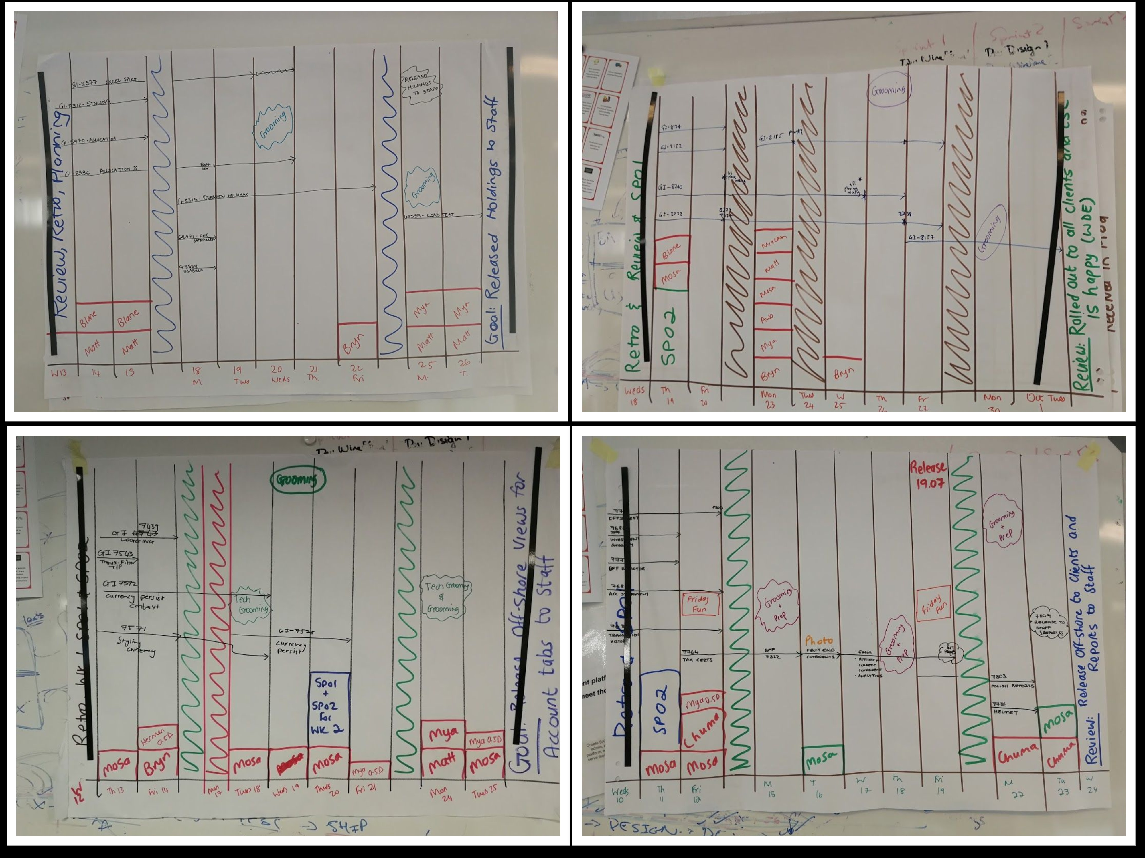
My gut reaction (as their Scrum Master) was pretty strong. I had flashbacks to my Project Administration and Project Manager days where my life was ruled by Microsoft Project Plans and unrealistic resource-leveling. I recalled long arguments about how, just because you could get a document through our intensive quality checks in two days, usually, it took about a week, plus you needed some days to rugby-tackle your busy stakeholder into signing it once it was ready. All this meant that your team was (in Gantt terms) “not working” for the duration of the document review task – which was unacceptable when everyone needed to be at a consistent 75% utilisation for the project. Then there were the status reports and percentage complete updates (how do you know you’re 50% complete if you’re not done yet?) and lines that jumped and moved (or didn’t) when your dependencies were mapped incorrectly.

All of the above happened in my head, of course, and we agreed to give the Gantt chart a try during SP02. Thankfully, besides knowing how to draw a basic frame, all my historic experience with Gantt charts meant I also knew which questions the team would need to answer to complete one – plus the mistakes people usually make when creating a visualisation of duration.

Before I share with you what we did, I think I’d better let you know how things turned out. The first few times we did it, people really struggled and it took a while to create the chart. However, with practice, it became just one more SP02 activity, and eventually, I didn’t need to help the team at all.

The visualisation helped us highlight where we were overcommitting ourselves (expecting one person to work on too many things at the same time; forgetting when a team member was on leave at a crucial point; or not finding ways to do some testing earlier). In making our poor planning assumptions visible, it helped the team figure out workarounds before the sprint even started e.g. for very long stories, they’d identify smaller milestones for feedback. Or where they realised that the type of work was very heavily weighted towards a particular skillset, they identified simpler pieces where less experienced team members could pair up and work together saving our “big hitters” for the more complicated stories. We also got better at accommodating sprint interruptions (like public holidays or whole-team-training) and adjusting our sprint forecast accordingly. Lastly, we started taking our Gantt into daily stand-up, and the team would adjust their Gantt plan at the end of stand-up which was a great way to see if we were on track and, where we weren’t, what needed to change.

How did we do it?

This is how we used the Gantt chart. Firstly, after SP01, I would create an empty framework for the 10 days of the sprint. I’d add any known “events” that would impact us, for example:

  • Our sprint ceremonies were on there
  • Any planned grooming slots were indicated
  • Planned leave/training was reflected- with the box size representing whether it was a half-day or full-day
  • Other significant “distractions” were added, like floor release dates
  • Any other planned meetings we were aware of after Sprint Planning 1 (SP01) were added
  • Weekends and any public holidays were blocked out
  • We also made the sprint goal visible on the last day (Review box)

The team would then work down their list of Backlog Items agreed in SP01. After discussing the item and the tasks for the work involved, they would then plot its expected start and finish date on the Gantt. As this was duration-based, in the beginning, I sometimes needed to remind them to add an extra day where a task ran over a public holiday or the person(s) the team assumed would be picking up the task (based on what was going on/availability) was going to be out of office. As they generally had an idea of who might be doing what, durations were also adjusted based on the person doing the work e.g. they would sometimes add extra time if the person was working in a space they were less familiar with. Even without thinking about who would be working on a specific task, the Gantt made it very clear when they were expecting to start more stories on the same day than there were people available to work on them. As previously mentioned, where stories looked to have a longer than usual duration, the team also brain-stormed mini-milestones where testing/checking could happen (e.g. if it was a five-day task, they’d try have something that could be tested/checked every 1-2 days). I added the tasks to the Gantt chart the first few sessions we used it, and once they’d got used to the idea, then a team member started doing it.

Finally, if the Gantt showed we’d been mistaken about our forecast in SP01, it meant we were able to communicate changes to the forecast before the sprint even started.

ganttall


This team had a specific problem to solve. As it turned out, the Gantt chart helped them create a shared view of their sprint plan which could be used to help them test their thinking/approach. It had a bit of a learning curve and took time and energy to create though, so I’d still caution against “just using it” for the sake of it. However, I’m also now likely to suggest a team tries it if they are experiencing similar planning problems to this team.

Have you ever used a Gantt chart for sprint planning? What did your team learn? Or have you been surprised by some other tool that you’d previously had bad experiences with? What was it and what did you learn?


My team had been working together for three sprints. During this time we’d been grooming and delivering stories (into Prod) but we had not done any sizing. Our Product Owner and business stakeholders were getting twitchy (“how long will we take?” – see How big is it?) and it was time to use our data to create some baselines for us to use going forward (and, as a side benefit, to find out what our velocity was).

Besides the fact that it was a new team, this team was also very large (15 people), some of them had never done an Affinity Sizing type exercise before, and we were 100% distributed (thanks to COVID19). Quite the facilitation challenge compared to the usual exercise requiring nothing more than a couple of index cards, masking tape and some planning poker cards. This is what I did and how it worked out.

1. Preparation

First, I needed something I could use to mimic the laying out of cards in a single view. As we’d already done three sprints of stories, there were a number of cards to distribute and I didn’t want to be limited to an A4 Word document page or Powerpoint slide. This meant a whiteboard (unlimited space) was required and we eventually ended up using a free version of  Miro.

Second, with my tool selected, I needed to make sure everyone in the team could actually access/use the tool. Unfortunately, Miro does require one to create an account, so prior to the workshop I sent a request to everyone on the team to try and access an “icebreaker” board.

Third, I needed to prepare my two boards:

  • The Icebreaker board which was to serve three purposes:
    1. Give people something to play around with so they could practise dragging and interacting with Miro
    2. Set the scene in terms of how sizing is different to estimating. Hopefully as a reminder to those who already knew, or as an eye-opener to those who might not.
    3. Use a similar format/process to the board I would be using for the Affinity Estimation exercise so that the team could get used to the process in a “safe” context before doing the “real thing”.
  • The Affinity Estimation board and related facilitation resources.

The Icebreaker Board

Ball game start

This layout matched the starting point of the Affinity Estimation exercise.

There was a reminder of what “size” was for the purposes of the exercise in red (1) and instructions for how to add the items to the scale (2). The block on the left was for the “stories” (balls) that needed to be arranged on the scale.

The Affinity Sizing Board

(I forgot to take a screenshot of the blank version, so this is a “simulation” of what it looked like.)

same blank stories

“Simulation”

For the Affinity Sizing, besides the board, I also prepared a few more things:

  1. A list of the stories (from JIRA) including their JIRA number and story title in a format that would be easy to copy and paste.
  2. The description of each story (from JIRA) prefixed with the JIRA number in a format that was easy to copy and paste
  3. I asked one of the team members if they would be prepared to track the exercise and ensure we didn’t accidentally skip a story.

A reminder that at the point when we did this exercise, we were about to end our third sprint, so we used all the stories from our first three sprints for the workshop (even the ones still in progress).

2. The session

The session was done in Zoom and started with the usual introduction: what was the purpose and desired outcomes.

From there, I asked the team members to access the “icebreaker board”. In the end, I had to leave the team to figure out how to use this board for themselves while I dealt with some technical issues certain team members were experiencing, so couldn’t observe what happened. However, when I was able to get back to them, I was happy enough with the final outcome to move on.

balls 2

Round 1: Small to Large

To kick things off, I copied and pasted the first story from my prepared list (random order) into a sticky and the story description (in case people needed more detail) into a separate “reference” block on the edge of the whiteboard. The first person to go then had to drag the story to where they thought it best fit on the scale.

From the second person onwards, we went down the list and asked each person whether they:

  1. Wanted to move any of the story-stickies that had already been placed or,
  2. Wanted a new story to add to the scale

A note here – it might be tempting to have some team members observe rather than participate (e.g. your designer or a brand new team member); however, I find that because mistakes will self-correct, there is more benefit in including everyone in the process.

We repeated the process until all the stories had been placed on the scale. At this point, it looked something like this (again, a “simulation”):

round 1 Round 2: Buckets

At this point I used two data points to make an educated “guess” to create a reference point.

  1. I knew that our biggest story to date was of a size that we could probably fit 2-3 of them in a sprint
  2. I could see where the stories had “bunched” on the scale.

So I picked the first biggest bunch and created a bucket for them which I numbered “5”. Then I drew buckets to the left (1,2,3) and to the right (8,13,20) and moved everything that wasn’t in the “5” bucket down to below the updated scale/grid (but still in the same order left-to-right).

buckets

Before we continued, I checked with the team whether the felt all the stories in the 5-bucket were actually about the same size. They did (but if there had been one that they felt might not be, it would have been moved out to join the others below the buckets). After this point, the stickies that had been placed in bucket five at the start of the process were fixed/locked i.e. they could not move.

Then we repeated the process again where each person was asked whether they

  1. Wanted to move a story-sticky that had already been placed into a bucket, or
  2. Move one of the unplaced story-stickies into a bucket

Initially, some people moved a couple of stories on their turn into buckets, which I didn’t object to as long as they were moving them all into the same bucket. Again, I was confident that the team would self-correct any really off assumptions.

We had one story that moved back-and-forth between bucket 1 and 2 a few times, and eventually, the team had a more detailed discussion and made a call and that story wasn’t allowed to move again (I also flagged it as a bad baseline and didn’t include it in future sizing conversations).

Once all the story-stickies had been placed in a bucket, everyone had one last turn to either approve the board or move something. When we got through a round of everyone with no moves, the exercise was done:

stories

The actual outcome of the workshop

Even with technical difficulties and approximately 15 people in the room, we got all of this done in 90 minutes. This is still longer than it would usually take face-to-face (I’d have expected to have needed half the time for a collocated session), but I thought it was pretty good going. And the feedback from the participants was also generally positive 🙂

These stories (except for the one I mentioned) then became baseline stories for comparing to when we did future backlog refinement. Also, because I now knew the total number of points the team had completed in the three sprints (sum of all the stories), we also now knew what our initial velocity was.

Have you ever tried to use Affinity Estimation to determine baselines? Have you tried to do so with a distributed team? What tools did you use? How did it go?


I have a new team. It is a fairly large team with varied experiences working in an agile fashion. We’re also still figuring how design fits into our overall value-delivery chain (as an organisation, not only as a team) and recently I found myself having to help clarify some expectations and terminology which had led to some confusion and conflict.

At this point, if you haven’t read these already, I’d recommend you read these two blog posts for some background context:

  1. Change Managing our Backlog Refinement
  2. Overlaying needs, phases and quality concerns

The conversations I had with various team members led to me creating this rough visualisation of what where you are in your Epic and backlog refinement conversations means for the necessary level of granularity of front-end design.

A caveat: I believe there could be a third axis – one for “figure out what the problem is” (Product Discovery), but due to where my team was in the delivery cycle, I left it off to reduce confusion. This scribble assumes we know what problem we need to solve.

UX vs ADKAR

So how does the above work?

The vertical (y) axis represents where your Epic is in its “quality” journey. Are we still just focusing on getting something working (Functional/Reliable)? Or are we polishing a feature that is almost ready for release or is already released (Usable/Pleasurable)?

The horizontal (x) axis represents where in the refinement process we are with the team for the piece we’re hoping to take into our next few sprints.

The colourful blocks (intersections) represent what level of visualisation the team probably needs for their refinement conversation based on x and y. So if we’re just starting on an Epic and want to get to a slice that does the basics for internal testing or Beta feedback (usable) and the team have had a conversation to understand the problem and are starting to think a bit more how to slice the next chunk into pieces of user value (Break-down), then you probably don’t need anything more granular than a wireframe to work with to have the conversation and figure out the next steps. If you’re already bringing pixel-perfect designs into a conversation at this point, there’s a lot of risk that there will be expensive re-work required. There’s also a risk you’ll miss out on a more creative approach/idea because the team will be less willing to suggest changes to something that has already had so much effort put into it. Finally, because pixel-perfect isn’t necessarily required for something usable, having a lower level of granularity (in this example, high fidelity) means it’s easier to make changes when we get feedback from users of the “usable” version of the Epic.

So far I have used this tool to help team members know what they need to prep for a backlog refinement conversation, and I plan to use it when facilitating conversations to the right-hand side of the y-axis so that team members remember that “grooming” isn’t always about ready stories.

Would you find this a useful tool? If you have used it, let me know how it went.

One of the challenges of working with software is that one is rarely building something from scratch. Usually, a team is working across a mix of maintaining existing (sometimes old) code; refactoring/migrating old concepts to new places; experimenting with new ideas; and/or just changing things to make life better. This can make it really hard to decide just how much effort needs to be put into a piece of work. Does it need to be the all-singing-dancing-tested story? Or will a cowboy-hack for fast feedback work just as well? And what does it mean to cowboy-hack in the financial industry vs for a game used by ten of my family members?

I work with a team that is working in the financial industry for a fairly high profile client that is nothing less than obsessed with their brand and reputation. Which is a good thing to worry about when people are trusting us with their life savings. We’re also busy migrating our web offering to a new technical platform, except it’s not purely a migration because we’re also extending our current offering to work on mobile devices, so there’s experimentation and user testing required too. In this environment, it’s very hard to deploy anything that hasn’t got a solid safety net (automated testing) whether it’s feature toggled on or not. In this environment, the focus is on keeping things safe rather than learning fast. And, sometimes, that leads to us over-engineering solutions when we’re not actually even sure we’re going to keep them. And that all means sometimes learning is very expensive and usually takes a long time.

With that context, we have recently had some conversations as a team about how we can narrow down our options and learn more quickly and cheaply for those pieces where we really don’t know what we need to build. A lot of good questions came out of that session, including one about when can we just hack something together to test a theory and when should we be applying due diligence to ensure code is “safe” and tested. Here are my thoughts (using two well-known and useful models – especially when used together) for thinking about when it is OK to experiment without worrying about things that keep us “safe”, and when we need to keep “safety” in mind while we iterate over an idea.

(In case it isn’t clear, there are cheaper ways than writing code to test out an idea – and those would be first prize. However, at some point you probably will need to build something to progress the fact-finding of ideas that have passed the through the first few experiment filters.)

The first model is fairly well known (and you can find a full explanation here):

MVP kniberg

The second is one I’ve newly learned about, and using them together was a great a-ha moment for me 🙂


Hierarchy of User Needs


How “safe” you need to keep stuff depends on where in the learning phase you are and what your experiment outcomes relate to.

The first phase is testing an idea. This is figuring out if something will even work at all. Will someone like it enough to buy it or pay for it? Do we even have the skills to use this? Does that third-party plugin do all the special things we need it to? At this point, you want to learn as quickly as possible whether or not your idea is even feasible. You may never even use it/build it. If you can even avoid writing code (the book “The Lean Startup” is full of great examples), then you should. It’s about getting as short a feedback loop going as possible. In the diagram, the person wanted something to help them got from A to B. One of the things that was tested was a bus ticket.

The second phase is building something usable. This speaks to the two bottom layers (and some of the third) of the hierarchy of user needs triangle above. Here we probably do need to keep our code safe because it’s not really usable (properly usable) until it is released. We will still be experimenting and learning, but some of those experiments will be around how does this work “in the wild” – e.g. from a user perspective, a performance perspective, or a feature perspective. Whatever you build in this phase you’re probably going to mostly keep and iterate over (because you’ve already tested the idea is valid), so you do have to consider maintenance (and, thus, care about things like automated testing) in this phase. At a micro level, within this phase, there probably will still be ideas that you need to test out and most of the experiments are more likely to be around how rather than what, but there is a blend of both.

The final phase – tackling the rest of the pyramid – includes adding in those “special effects” but ALSO incorporating more of the nice-to-have feedback from users that you should have gained from all your experiments along the way. In the transport example, the car at the end is a convertible rather than a sedan. A sedan would have been perfectly usable, however at some point when they were testing out ideas, the user mentioned that the one reason they preferred the skateboard over the bus ticket is that they liked to feel the fresh air in their face. That kind of feedback is what makes things lovable/special – although in no way does it may it more usable. FYI most organisations running an iterative approach often choose to stop once they get here, due to the law of diminishing returns. The problem with waterfall is because everything was done big bang, you didn’t have the option of stopping when you’d “done enough” (because there were no feedback loops to figure out when done enough was).

Depending on a team’s context, we could be anywhere on this journey depending on which idea or feature we are talking about. Which is why the WHY becomes super important when we’re discussing a product backlog item. WHY are we doing this piece of work? WHAT do we need to get out of it? WHAT is the assumption that we want to test? And what does that mean for how much effort and rigor we need to apply to that piece of work?

Besides helping teams identify what kind of work they should be focusing on, these two models (especially the user needs one) have been helpful to me when having conversations of where UX and UI fit into the Scrum team mix. If you think of UX as part of making things basically usable (the bottom part of that layer if you will); a combination of UX/UI moving you into the pleasurable layer; and UI creating the cherry-on-top – then it’s easier to see when just building to a wireframe is OK (to get feedback on functional and reliable) vs having something pixel perfect with animations (that incorporates what we learned from testing functional, reliable features).

Or, roughly:

User Needs wth UI-UX

Let me know if you find these two models helpful. Have you used them before? Where have you found that they didn’t translate that well into a real life scenario? What did you learn?